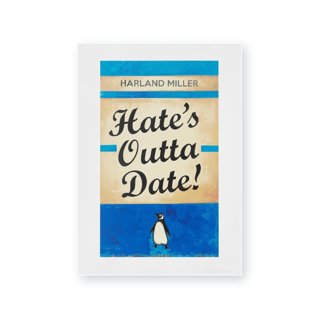
Harland Miller
Hates Outta Date - Blue
2022
Screenprint in colours on wove paper
70 × 50 cm
Ed. / 125 — Signed and numbered
Location: London, United Kingdom

Arianee token ID
176213270
Share by
Email
Documents
-
Invoice or proof of purchase
-
Certificate of authenticity
-
Other documents
About the artwork
Produced in 2022,this screenprint presents the invented title “HATES OUTTA DATE” in oversized lettering on a blue,deliberately weathered book cover. Smaller lines of text and the rectangular border reinforce the appearance of a mass-market paperback. The cool palette and distressed surface combine graphic immediacy with the suggestion of an object carrying its own history.
The stated technique is screenprint in colors on wove paper. It measures approximately 70 × 50 cm. Layered screenprinting produces solid letterforms alongside deliberately irregular areas that imitate fading,abrasion and handling. The rectangular border and typographic hierarchy maintain the structure of a book jacket even when the image is viewed at the scale of a wall work.
Expert opinion
The blue palette gives the fictive cover a cooler and more reflective character than the yellow version. The title compresses anxiety about taste,aging and cultural relevance into the language of publishing. As in Miller’s strongest text works,humor makes the phrase accessible while leaving its emotional target deliberately uncertain.
In the context of Harland Miller’s editions,Hates Outta Date - Blue is notable because it gives an invented phrase the history and emotional weight of a familiar literary object.
About the artist
Harland Miller (born 1964 in Yorkshire, England) is a British artist and writer whose practice combines painting, literature, typography and popular culture. Best known for his paintings and prints based on the graphic language of vintage book covers, Miller uses fictional titles, wordplay and dark humour to explore the relationship between image and text. He lives and works in London.
Books and language have played a central role in Miller's work throughout his career. Growing up in Yorkshire during the 1970s, he developed an early fascination with literature and the particular humour of northern England. During the 1980s and 1990s, he lived and worked in cities including New York, New Orleans, Berlin and Paris, absorbing influences from Pop Art, Abstract Expressionism and Colour Field painting.
Miller began experimenting with the visual identity of Penguin books in the early 1990s. These works appropriate the familiar layout, typography and colour bands of classic Penguin dust jackets while replacing the original titles with phrases invented by the artist. Humorous, melancholic, provocative or deliberately ambiguous, these titles allow Miller to bring together his interests in writing and painting while exploring the immediate power of words within an image.
Alongside his visual practice, Miller has established himself as a writer. His first novel, Slow Down Arthur, Stick to Thirty, was published in 2000 and received critical acclaim. In 2002, he was Writer in Residence at the Institute of Contemporary Arts in London. Literature has continued to inform his artistic practice, with references ranging from Edgar Allan Poe to the physical and emotional histories embodied by old books.
Over time, Miller has expanded beyond his celebrated book-cover works to develop series centred on individual letters and short words. These paintings explore typography not simply as a carrier of meaning but as a visual form in itself. His Letter Paintings, for example, combine bold graphic structures with painterly abstraction, while retaining the humour, ambiguity and linguistic play characteristic of his earlier work.
Humour is fundamental to Miller's practice, but it often coexists with darker themes including love, loneliness, psychology, nostalgia and the passage of time. His works frequently operate on two levels: the viewer first reads the words almost instinctively and then encounters the painting as an arrangement of colour, texture, typography and form.
Miller's work has been exhibited internationally, with solo exhibitions at institutions and galleries including York Art Gallery, the BALTIC Centre for Contemporary Art, the Institute of Contemporary Arts in London and White Cube in London, Paris and Hong Kong. His distinctive fusion of painting and language has made him one of the most recognisable British artists working with text today.
Additional info
3x
OTHER ARTWORKS YOU MAY LIKE
Your Dynamic Snippet will be displayed here...
This message is displayed because you did not provide both a filter and a template to use.